On my front cover I will need a title, like most other magazines I will place this at the top. I will use a big bold font to make it stand out, that will probably be the same font I use throughout the magazine. I've found some fonts which I think will work well on the cover of my magazine.
Idsall
News – Harrington
Idsall
News – Bodoni MT Black
Idsall
News – Castellar
Idsall
News- Bookman Old Style
Idsall
News- Freestyle Script
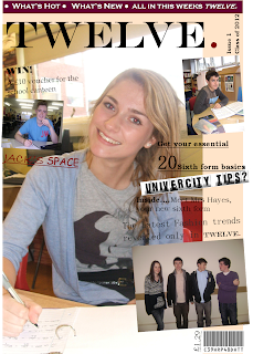
Here's an example of a school magazine, although this title stands out I wouldn't of put the strip across the very top as it takes your eyes away from the title.
As I am not selling my product I won't need the bar code or price. I could of put them on to make it look more realistic however as it's for my school, so I don't need it. Another thing I wont be needing is free giveaways, as the school has nothing to giveaway!
Another code and conventions I will be using is cover lines. Like most other magazines I will be placing these round the main picture that will be in the middle. These will show people what is inside, it could also tell people what page a certain article or picture is on. I will also use the main cover line just below the title to show the main content. However I won't be using a strip across the top or bottom of the magazine containing lists of items which feature in the magazine as with the cover lines I won't need it.
Lastly, I will choose only a couple of colours to have on and inside my magazine. The colours will probably be the same as my school logo, which is green but I will have a couple more colours - probably black or gold as I think they will complement each other. This example has the same colours all throughout the cover, I think keeping the colours simple makes the magazine look better than if there was loads of colours on the page. This example looks good because the title and the cover lines are the same shade which complements the photo to.


No comments:
Post a Comment