On these examples there is just a small section of colour on each page, this is to make the article more appealing, however this also could be to make the whole magazine stand out and be different to what's on the shelves at the moment. The red in these double page spread link is in with Q magazine because the logo for Q is bright red, this helps the reader make a link with the different magazines.
Friday, 29 November 2013
Double Page Spread
I have looked at some double pages spreads that are included in some of Q Magazine's issues. These double pages hold the main article so they need to stand out and be striking in order to catch the reader's eye and insure that they will suit the target audience for this magazine.
On these examples there is just a small section of colour on each page, this is to make the article more appealing, however this also could be to make the whole magazine stand out and be different to what's on the shelves at the moment. The red in these double page spread link is in with Q magazine because the logo for Q is bright red, this helps the reader make a link with the different magazines.
For the music magazine I have to create I would like to follow the idea of Q magazine having the main image black and white with sections of colour that link in to my magazine as a whole.
On these examples there is just a small section of colour on each page, this is to make the article more appealing, however this also could be to make the whole magazine stand out and be different to what's on the shelves at the moment. The red in these double page spread link is in with Q magazine because the logo for Q is bright red, this helps the reader make a link with the different magazines.
Wednesday, 27 November 2013
Contenets page analysis
Every magazine has a contents page, it helps you to explore the articles, pictures and gossip or information a lot easier as you don't hunt around for the items you want to see.
First of all the layout of the contents is usually in columns, either 3 or 4. This helps split the magazine up into sections so you can find your page easier. With this, there will usually be images connecting to the feature article and a few others dotted around the ouside. Here is a contents page for Q magazine, they've not got many pictures relating to the feature articles however they have got one, this could tell you that in this months issue there is more reading to be done.
Every magazine has a structure which they stick to. This helps to create a constant magazine and develope the brand. Page numbers are very helpful as they show you where the article is. Another reason there so useful is because when magazine companies put the page number on a picture, it anchors it to the written content. Contents pages are usually split up into categories and headings which are used to identify each section of the magazine. Some categories are main articles, features and regulars. This example of Q magazine shows there structure is constsnt throughout every issue.
Contents pages are usually written in the same conventional way: first line -page number, 1 or 2 words which could be the artists name or ambigious text to intrigue the reader in blod type or usually capitals however this isn't always the case. Another thing some magazine contents pages have is sublines, these give more specific detail about what the articles about, for sublines magazines usually use smaller font.
Lastly, on the contents page they usualy have the title of the magazine, a page number, an issue date and oftern a web address. Usually contents pages are one or two page spread, depending on the size of the magazine.
Tuesday, 26 November 2013
Genre
The genre of music I have chosen to do is alternative music. This is based on Q Magazine as there is a variety of different music incorporated in the magazine.
I have chosen to do alternative music because I think it appeals to a wider range of people therefore more people will be intrested in the finished magazine.
Sunday, 24 November 2013
Front Cover Anaylsis
I am going to analyse the front cover of Kerrang magazine. I will highlight the codes and conventions of the front cover, this will help me to understand what I have to add into my magazine when I create it.
Mast Head
The mast head is covered by the main image, as Kerrang is a well known magazine it doesn't matter that the picture is covering the mast head as there target audience would still buy the magazine. The amount of information on the front cover means that the mast head will have to be covered a small amount to fit everything on.
Pug
This pug is towards the top left hand corner, this tells the reader something is for free. Ususally we read from left to right so positioning the pug in the top left hand corner means its something the target audience will see first, wanting them to buy it.
Coverlines
The coverlines are telling the reader other stories that are inside the magazine. The yellow and red contrast together, this makes them stand out and your eyes get instantly drawn towards it.
Colour Scheme
The main colour scheme is black and red, this makes the red writing and background stand out so that it's read first. The mast head is in red to make it stand out as the main cover image hides the mast head a little. Aswell as the red and black colour scheme there is also yellow on the colour, the yellow contrasts with the red and black to make the pugs and puffs stand out alot more.
Puff's
There is a puff at the bottom of the magazine, this is because when the target audience has finished reading the front cover they usually finish in the bottom right hand corner. This leaves them wanting the magazine more as they want to read the articles that are inside.
Mode of Access
On the main cover image, one person is pointing directly down the camera this makes us think that he's pointing at us. This could persuade someone to buy the magazine even more as he could be in some way communicating to that reader. Usually on the front of magazines they use 2nd person or personal pronouns like "you" to communicate to there target audience.
Straight forward features
Every magazine has straight forward features that they have to include, this will contain a bar code, price and issue number. On this Kerrang magazine they are all placed together, this makes it easier for the reader to find it.
Wednesday, 20 November 2013
Existing front covers
Here are a few different genres of music magazines. For my next project, I will have to choose a genre of music and produce a magazine with a front cover, contents page and double page spread to do with the genre of music I have selected.
Thursday, 14 November 2013
Evaluation of my school magazine
As I've now finished my school magazine and had feedback for it, I've now got to evaluate my performance and finished product.
Overall I think my finished magazine isn't bad for a first attempt; however I could do better if I got the opportunity to do it again. I feel like I did the right amount of planning needed for this product, I planned it out on paper, and then drew a quick sketch up on the computer of where I'd have the pictures, mast head and the information about my school. For both the contents page and the front cover I think that I went along with the major codes and conventions of main stream magazines, just at a more basic level.
If I had more time I think I could of produced a slightly better quality magazine front cover and contents page. I would of learnt how to use the software before I needed to use it so I didn't go straight into producing my magazine. However I am happy with my finished product although there can be some improvements to make it look more realistic.
Wednesday, 13 November 2013
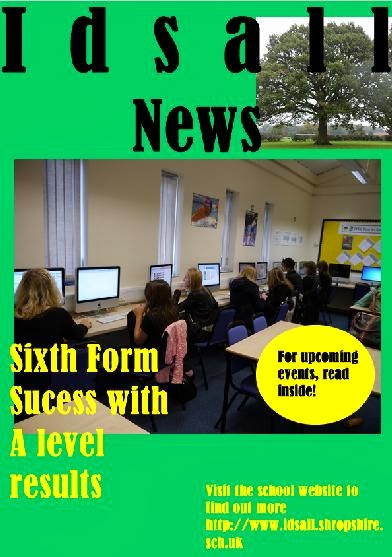
Finished Magazine
After I got my feedback back, I changed around the layout of my magazine and this is my finished product.
Subscribe to:
Posts (Atom)