
Thursday, 5 December 2013
Questionnaire
This is my questionnaire that I have asked people to complete in order for me to get a better understanding on music magaqzines and how they appeal to the target audience.

Friday, 29 November 2013
Double Page Spread
I have looked at some double pages spreads that are included in some of Q Magazine's issues. These double pages hold the main article so they need to stand out and be striking in order to catch the reader's eye and insure that they will suit the target audience for this magazine.
On these examples there is just a small section of colour on each page, this is to make the article more appealing, however this also could be to make the whole magazine stand out and be different to what's on the shelves at the moment. The red in these double page spread link is in with Q magazine because the logo for Q is bright red, this helps the reader make a link with the different magazines.

 For the music magazine I have to create I would like to follow the idea of Q magazine having the main image black and white with sections of colour that link in to my magazine as a whole.
On these examples there is just a small section of colour on each page, this is to make the article more appealing, however this also could be to make the whole magazine stand out and be different to what's on the shelves at the moment. The red in these double page spread link is in with Q magazine because the logo for Q is bright red, this helps the reader make a link with the different magazines.


Wednesday, 27 November 2013
Contenets page analysis
Every magazine has a contents page, it helps you to explore the articles, pictures and gossip or information a lot easier as you don't hunt around for the items you want to see.
First of all the layout of the contents is usually in columns, either 3 or 4. This helps split the magazine up into sections so you can find your page easier. With this, there will usually be images connecting to the feature article and a few others dotted around the ouside. Here is a contents page for Q magazine, they've not got many pictures relating to the feature articles however they have got one, this could tell you that in this months issue there is more reading to be done.


First of all the layout of the contents is usually in columns, either 3 or 4. This helps split the magazine up into sections so you can find your page easier. With this, there will usually be images connecting to the feature article and a few others dotted around the ouside. Here is a contents page for Q magazine, they've not got many pictures relating to the feature articles however they have got one, this could tell you that in this months issue there is more reading to be done.

Every magazine has a structure which they stick to. This helps to create a constant magazine and develope the brand. Page numbers are very helpful as they show you where the article is. Another reason there so useful is because when magazine companies put the page number on a picture, it anchors it to the written content. Contents pages are usually split up into categories and headings which are used to identify each section of the magazine. Some categories are main articles, features and regulars. This example of Q magazine shows there structure is constsnt throughout every issue.

Contents pages are usually written in the same conventional way: first line -page number, 1 or 2 words which could be the artists name or ambigious text to intrigue the reader in blod type or usually capitals however this isn't always the case. Another thing some magazine contents pages have is sublines, these give more specific detail about what the articles about, for sublines magazines usually use smaller font.

Lastly, on the contents page they usualy have the title of the magazine, a page number, an issue date and oftern a web address. Usually contents pages are one or two page spread, depending on the size of the magazine.
Tuesday, 26 November 2013
Genre
The genre of music I have chosen to do is alternative music. This is based on Q Magazine as there is a variety of different music incorporated in the magazine.
I have chosen to do alternative music because I think it appeals to a wider range of people therefore more people will be intrested in the finished magazine.


Sunday, 24 November 2013
Front Cover Anaylsis
I am going to analyse the front cover of Kerrang magazine. I will highlight the codes and conventions of the front cover, this will help me to understand what I have to add into my magazine when I create it.


Mast Head
The mast head is covered by the main image, as Kerrang is a well known magazine it doesn't matter that the picture is covering the mast head as there target audience would still buy the magazine. The amount of information on the front cover means that the mast head will have to be covered a small amount to fit everything on.
Pug
This pug is towards the top left hand corner, this tells the reader something is for free. Ususally we read from left to right so positioning the pug in the top left hand corner means its something the target audience will see first, wanting them to buy it.
Coverlines
The coverlines are telling the reader other stories that are inside the magazine. The yellow and red contrast together, this makes them stand out and your eyes get instantly drawn towards it.
Colour Scheme
The main colour scheme is black and red, this makes the red writing and background stand out so that it's read first. The mast head is in red to make it stand out as the main cover image hides the mast head a little. Aswell as the red and black colour scheme there is also yellow on the colour, the yellow contrasts with the red and black to make the pugs and puffs stand out alot more.
Puff's
There is a puff at the bottom of the magazine, this is because when the target audience has finished reading the front cover they usually finish in the bottom right hand corner. This leaves them wanting the magazine more as they want to read the articles that are inside.
Mode of Access
On the main cover image, one person is pointing directly down the camera this makes us think that he's pointing at us. This could persuade someone to buy the magazine even more as he could be in some way communicating to that reader. Usually on the front of magazines they use 2nd person or personal pronouns like "you" to communicate to there target audience.
Straight forward features
Every magazine has straight forward features that they have to include, this will contain a bar code, price and issue number. On this Kerrang magazine they are all placed together, this makes it easier for the reader to find it.
Wednesday, 20 November 2013
Existing front covers
Here are a few different genres of music magazines. For my next project, I will have to choose a genre of music and produce a magazine with a front cover, contents page and double page spread to do with the genre of music I have selected.


Thursday, 14 November 2013
Evaluation of my school magazine
As I've now finished my school magazine and had feedback for it, I've now got to evaluate my performance and finished product.
Overall I think my finished magazine isn't bad for a first attempt; however I could do better if I got the opportunity to do it again. I feel like I did the right amount of planning needed for this product, I planned it out on paper, and then drew a quick sketch up on the computer of where I'd have the pictures, mast head and the information about my school. For both the contents page and the front cover I think that I went along with the major codes and conventions of main stream magazines, just at a more basic level.
If I had more time I think I could of produced a slightly better quality magazine front cover and contents page. I would of learnt how to use the software before I needed to use it so I didn't go straight into producing my magazine. However I am happy with my finished product although there can be some improvements to make it look more realistic.
Wednesday, 13 November 2013
Finished Magazine
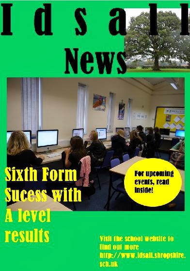
After I got my feedback back, I changed around the layout of my magazine and this is my finished product.

Feedback from fist magazine attempt
As part of my first project I had to create a magazine for my school. I'm part of the sixth form so I'm going to base my magazine around years 12 and 13. This means I can focus on more issues that go on in the sixth form rather than issues developed by years 7-11. My first draft of my magazine was very basic without a lot of pictures or information, so after I got feedback I knew I had to change it around. The feedback I got was basically telling me to add more information and more pictures to the contents page. So that is what I did.
Images
As I've had to use my own images, I've had to edit them myself to. The first image I edited, I cropped down all the sides so I made the image smaller than the original image. I then used a tool to make the whole image brighter. This image is of the two sixth form students, that I have placed on my contents page.
The wide angle shot of everyone working I've not edited. I didn't feel it needed anything doing to it as it's not a single person, it's a group of people so you can't really see their faces, therefore I didn't edit it at all. This image is my main image, I've used it as my front cover image.
The image I took of the tree, I've cropped it down so that the focus is only on the tree and not the surrounding area. I also darkened the surrounding area so that the tree stands out more. This image I have used in the upper right corner on both my front cover and contents page. I have places it behind the writing as the title needs to be seen more than the tree does.
Friday, 8 November 2013
Picture taking
For my school magazine I needed my own pictures to show the sixth form part of the school. I needed to used different shots like mid shot and close up shot. Firstly I started by taking pictures of pupils when they were working.


The first I've used a mid shot for both of these pictures, this shows the students working and it could also show the dress code that idsall has in place.
For these pictures I used a wide angle shot so I could get everyone working at the computers in.
I have used the top picture as my front cover picture, I've done this to encorporate the communal feel of the school into the magazine itself.
For my contents page I've used two pictures of sixth form students.


The first I've used a mid shot for both of these pictures, this shows the students working and it could also show the dress code that idsall has in place.
Wednesday, 6 November 2013
Magazine Draft
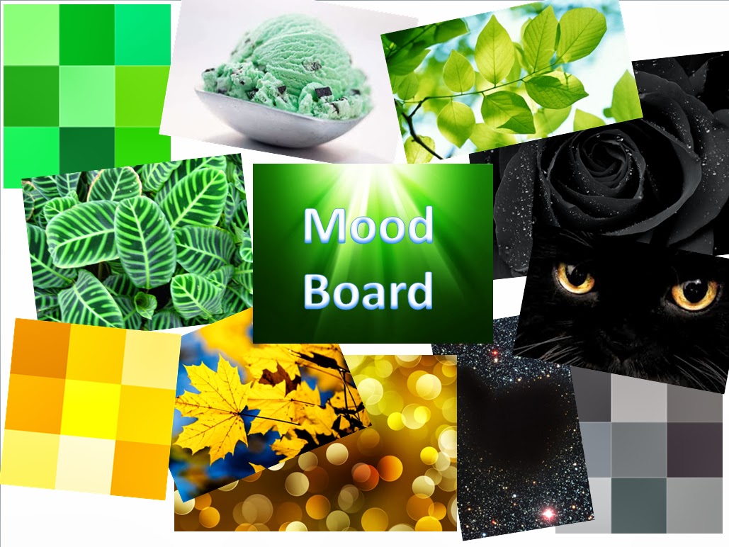
Before I started c reating my school magazine, I created a simple draft of what my magazine layout may look like. My colour scheme for my magazine will be green, black and yellow. These are all parts of our school colours so they will link in with the overall feel of a school magazine.

Wednesday, 9 October 2013
Editing
Everything that is in the media has been edited, either to make the person 'better' looking or to add a effect to make the picture stand out more. So for one of our tasks we had to edit three pictures, a close-up shot, mid shot and a long shot. For my close-up shot I took a picture of Kiera Knightly. I've not edited her face at all but I've given the picture a colour background, and I put a darker shade round her head then I used the burn tool to make her hair a shade darker and then used the smudge tool to slightly blend her hair into the background. The original unedited images are the bottom images and the ones I've edited are the top images.


For the mid image
I edited a picture of Mila Kunis. For this I increased the brightness,
sharpness and the colour to give it a warmer tint to it.


For the long shot I chose a picture of Cara Delevigne. On this picture I cut her out and pasted her 3 times. I then added a gradient to the left of the picture which was black and white and on the right of the picture I took away the black and white effect slightly so you can see her skin tone.


Tuesday, 8 October 2013
Mood Board
To create a school magazine I had to make a mood board, this will help me to get the colours and shades I want for my magazine. The main school colours off our school are green, yellow and black. These are the main 3 colours I am going to incorporate in my magazine.

Wednesday, 2 October 2013
What is an audience?
Throughout media and Film studies audience is one of the most frequently used terms. It’s a massive part of film, TV programmes and all other types of media. Overall audience helps the media industry to find out whether there programme, film, magazine etc. is worth presenting to the public. An audience is something that we tend to analyse at a distance, making generalisations about it, how we feel about it, what it means. It’s also something in which we are involved in, whether we like it or not.
We are part of an audience. We decide whether a film is good or not, we choose what magazines we buy, we watch TV programmes. This means that companies can find out what the public enjoy or like, they can find out what different target audience's like. There are loads of small compartments that creates an 'audience' this could be age group, gender, class, ethnic etc. Even if you don't want to, you are part of an audience.
My own definition of audience is 'audience is everyone, the media give us films, books, TV programmes, magazines etc. and we judge them based on our own personal likes and dislikes.'
Wednesday, 18 September 2013
Codes and Conventions
As part of our preliminary task, we have to create a school magazine. Magazines in general have codes and conventions they all use (as I posted earlier). As my magazine is only for my school, I won't be using all the codes and conducts that major magazines use however I will be using some.
On my front cover I will need a title, like most other magazines I will place this at the top. I will use a big bold font to make it stand out, that will probably be the same font I use throughout the magazine. I've found some fonts which I think will work well on the cover of my magazine.
Here's an example of a school magazine, although this title stands out I wouldn't of put the strip across the very top as it takes your eyes away from the title.
As I am not selling my product I won't need the bar code or price. I could of put them on to make it look more realistic however as it's for my school, so I don't need it. Another thing I wont be needing is free giveaways, as the school has nothing to giveaway!
Another code and conventions I will be using is cover lines. Like most other magazines I will be placing these round the main picture that will be in the middle. These will show people what is inside, it could also tell people what page a certain article or picture is on. I will also use the main cover line just below the title to show the main content. However I won't be using a strip across the top or bottom of the magazine containing lists of items which feature in the magazine as with the cover lines I won't need it.
Lastly, I will choose only a couple of colours to have on and inside my magazine. The colours will probably be the same as my school logo, which is green but I will have a couple more colours - probably black or gold as I think they will complement each other. This example has the same colours all throughout the cover, I think keeping the colours simple makes the magazine look better than if there was loads of colours on the page. This example looks good because the title and the cover lines are the same shade which complements the photo to.

On my front cover I will need a title, like most other magazines I will place this at the top. I will use a big bold font to make it stand out, that will probably be the same font I use throughout the magazine. I've found some fonts which I think will work well on the cover of my magazine.
Idsall
News – Harrington
Idsall
News – Bodoni MT Black
Idsall
News – Castellar
Idsall
News- Bookman Old Style
Idsall
News- Freestyle Script
Here's an example of a school magazine, although this title stands out I wouldn't of put the strip across the very top as it takes your eyes away from the title.

As I am not selling my product I won't need the bar code or price. I could of put them on to make it look more realistic however as it's for my school, so I don't need it. Another thing I wont be needing is free giveaways, as the school has nothing to giveaway!
Another code and conventions I will be using is cover lines. Like most other magazines I will be placing these round the main picture that will be in the middle. These will show people what is inside, it could also tell people what page a certain article or picture is on. I will also use the main cover line just below the title to show the main content. However I won't be using a strip across the top or bottom of the magazine containing lists of items which feature in the magazine as with the cover lines I won't need it.
Lastly, I will choose only a couple of colours to have on and inside my magazine. The colours will probably be the same as my school logo, which is green but I will have a couple more colours - probably black or gold as I think they will complement each other. This example has the same colours all throughout the cover, I think keeping the colours simple makes the magazine look better than if there was loads of colours on the page. This example looks good because the title and the cover lines are the same shade which complements the photo to.

Codes and Conventions
For magazines there are different codes and conventions they all follow. On the front cover of magazines there is one main feature article, usually about the person on the front cover. The picture taken is either a close-up shot or a mid shot. For example this front cover of EllE Magazine had a mid shot of Jennifer Lopez, this encourages people to buy the magazine because inside there is an article on her. All the colours used on front colours are usually very simple and there is only a couple of different shades. On this example they've used blacks and greys, this could be to complement Jennifer Lopez's skin tone and make her and the cover look more attractive so more people buy it.

On the front cover there also has to be a title, this is usually one or two words and fills the width of the page. In this example of ELLE Magazine the title is across the top and the mid shot of Keira Knightly is covering the middle two letters. This is the same for many well-known magazines to have the photo cover up some of the title. Also on a lot of magazines they need to have the bar code which is commonly put on the right of the cover and the issue number and price which is also put on the right but can also be found by the barcode.

Free giveaways are common among more
children ages magazines as this catches there eye and they want to buy it.
However you do get giveaways with magazines like ELLE and VOGUE but it’s rare
as they are mainly magazines just for fashion and articles on the cover
girl/man.
Another code and conventions the magazine
business live by is cover lines, a cover line is lines of the text on the cover
that attract the audience. They usually go over the cover girl/man a little.
The main cover line is the larger section of text that usually sits under the
title. It may be about the article inside. For example, this VOGUE magazine
with Kate Moss on the cover has her name under the title in a bigger sized font
than the others around it. Also at the bottom the font size is bigger to tell
people who are thinking of buying it what might be inside, it gives them a
sneak peak of what’s to come.

Lastly, on magazines they like
to give you a hit of what’s inside. This could come in the form of a strip across
the bottom of the cover however it's mostly put down the side of the cover
girl/man. This links in with the cover lines. On this example of VOGUE with
Rihanna on the cover, they've put the snippets of information that's inside
round the edge of her mid mid shot. Like other VOGUE magazines it's roughly the
same layout, this is because they want all the magazines to be similar in style
so they've got one unique style and people can know what the magazine is about
before they buy it. They have a reputation to be the best of the fashion/gossip
section of magazines so a constant style allows that to happen.

Tuesday, 17 September 2013
Hey, My names Lily and welcome to my media blog.
I am at Idsall Sixth Form and I'm studying Media, Art, I.t and Product Design.
This is the first post for my media blog, so I'm going to tell you what's it all about. The purpose of this blog is for me to keep upto date with everything I'm doing and to show the order I'm completing tasks in.
I hope you enjoy my blog,
Lily
Subscribe to:
Comments (Atom)